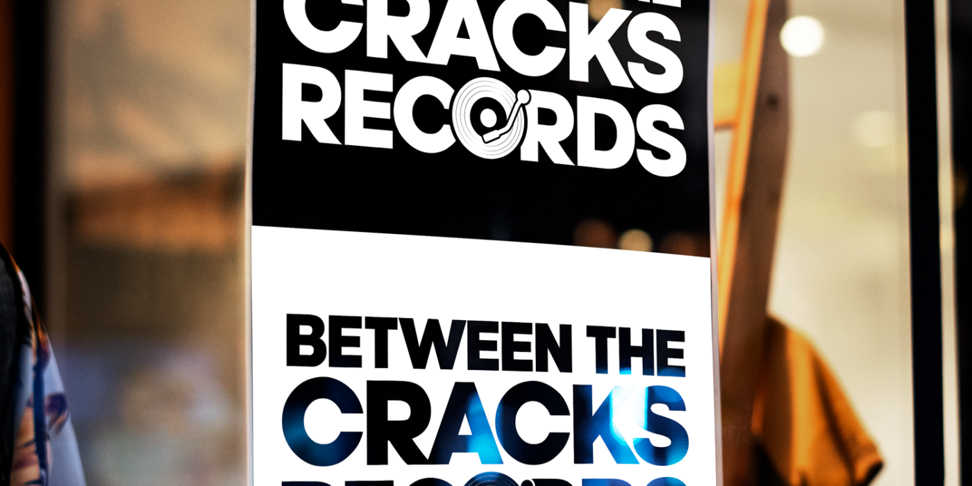
A brand new Seattle-based record label on the rise, Between the Cracks Records, needed a logo to kick things off. They wanted something bold, but with a graphic vinyl record somehow incorporated into it. We went through a couple iterations, but ultimately landed on the simple text with a vinyl record as the “O.”
For ease of use, the logo is monochrome, so can be transposed on either white or black and still be easily recognizable. A version of the logo with just the brand acronym (BTCR) can be used, in the same font as the main logo, in cases where less space is available or the record elements are too small to be recognizable.


